The evolution of Tibetan typefaces: anatomy and historical development of Tibetan fonts
Origins of Tibetan writing
Little is known about the exact origins of Tibetan writing. According to tradition, the creation of this writing system is associated with King Songtsen Gampo, who unified Tibet and reigned between 620 and 645 CE. According to other sources, however, writing spread to Tibet via Kashmir and Turkestan.
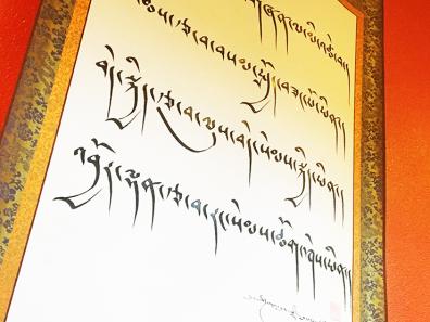
Almost from the start, two distinct writing styles appeared simultaneously: dbu can (pronounced uchän) and dbu med (pronounced umé). Dbu can can be translated as "with head", referring to the upper stroke each character contains.
This feature is to be related to the Gupta script that was in use in India in the 7th century, on which Thonmi Sambhota, the presumed inventor of the Tibetan writing system, is said to have copied Tibetan letters.
The dbu can was (and still is) the preferred script for official documents, Buddhist texts and administration, at least during the imperial period (7th-9th century).
This then became a model, first for type engraved on xylographic plates and then, from the 18th century in the West, for print type. The dbu can was also used to define body text for non-religious publications. The dbu can letterform lent itself very well to epigraphy and was preserved for xylographic plate engraving[1].
The dbu med ("headless") is a rounder, cursive handwriting that does not have a stroke on the top line.
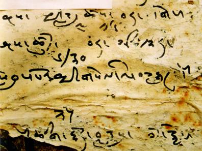
This more informal script, which gave rise to at least ten different calligraphic styles, was used primarily for personal correspondence, poetry and calligraphy.
The Tibetan graphic system became standardized as early as the 7th century and has changed very little since.
The Tibetan syllable structure
The Tibetan script belongs to the alphasyllabic or "syllabic alphabet" category; it is used by around 7 million people mainly in Tibet, South Asia, parts of Inner Asia and the Tibetan diaspora. Tibetan is read horizontally and from left to right.

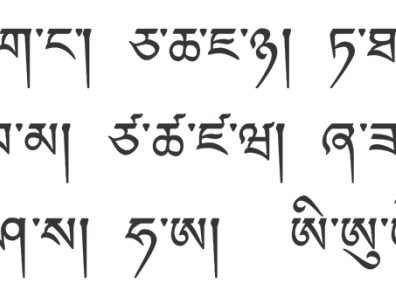
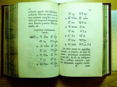
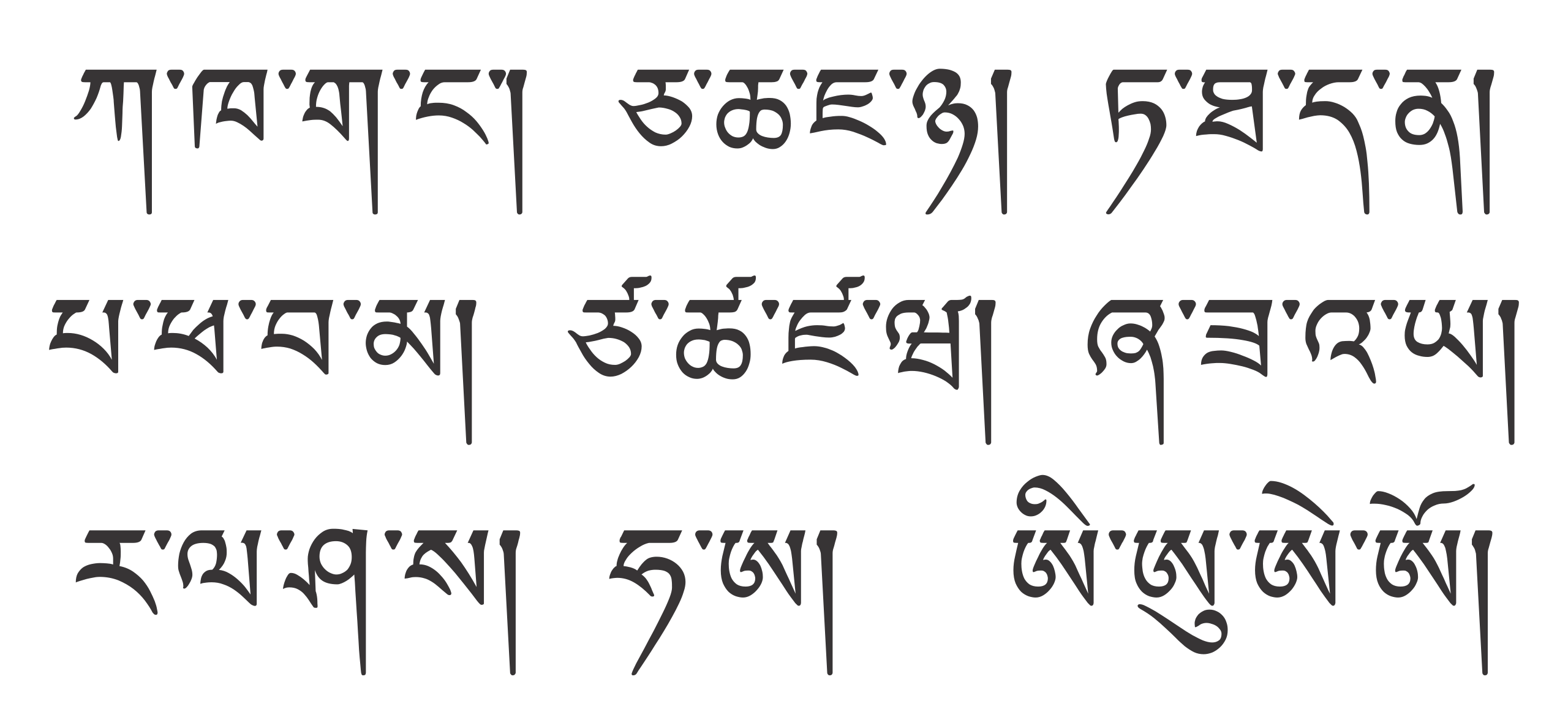
It consists of thirty basic consonant signs and four vowel signs (i, u, e, o).
These can also be combined with other consonants, forming more or less complex syllables.
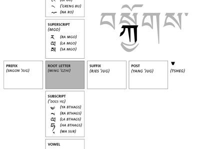
Several letters can be combined within a single syllable, either vertically (top, bottom), horizontally (left, right) or both. In the vertical direction, you can add an "elicited" letter above the root letter, and/or an "underlined" letter below the root letter. Horizontally, the root letter can be preceded by a "prefixed" letter, or followed by a "suffixed" letter, which in turn can be followed by a second suffixed letter. In this way, up to three consonants can be superimposed vertically (root letter in the middle + one letter on top + one letter underneath), and four letters aligned horizontally. The vowel sign can always be added. The number of elements making up a syllable thus ranges from one (the single root letter) to eight (seven consonant elements and one vowel), and sometimes a little more for some borrowed terms, notably from Sanskrit, Chinese and other languages.
Example of increasing syllable spelling complexity:
Root letter: ga
ག་
Root letter topped by the vowel 'i':
གི་
Root letter surmounted by the vowel 'i' and the raised letter 'sa':
སྒི་
Root letter surmounted by the vowel 'i' and the raised letter 'sa', and possessing the underscored letter 'ra':
སྒྲི་
Root letter surmounted by the vowel 'i' and the raised letter 'sa', possessing the underscored letter 'ra', all preceded by the prefixed letter 'ba':
བསྒྲི་
Same set as above, followed by the suffixed letter 'ga':
བསྒྲིག་
Finally, a complete and complex set, with the addition of the second suffixed letter 'sa' to the previous group:
བསྒྲིགས་
The letters do not, however, combine arbitrarily to form syllables: only three of the alphabet's thirty consonants can be suscribed, while four can be subscribed; five can be placed in prefix position, ten in suffix position and only two in second suffix position. But no matter how complex the syllable, it always results in a single phoneme (thus, in French, 'o', 'ho', 'haut', 'hauts', 'eau' and 'eaux' are all pronounced 'o').
When letters are combined with each other, they can change size or even shape (a bit like, in French, the 's' which, placed under the 'c' to form the cedilla, is stylized).
The letter 'la' in root-letter position:
ལ་
The letter 'la' in subscript-letter position, therefore smaller:
གླ་
The letter 'ya' in root-letter position:
ཡ་
The letter 'ya' in subscript-letter position, smaller and stylized:
གྱ་
Syllables are always as if hanging from the top line (unlike our letters, which are all aligned from below and resting on the base line) and only three vowel signs (i, e, o) can appear above this upper line - the u being noted below the radical letter or subscript
.
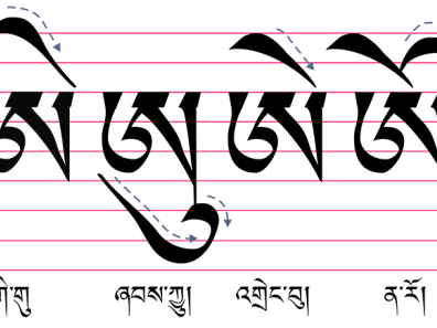
Tibetan words are monosyllabic and dissyllabic, and more rarely tri- or quadrisyllabic. The syllables are separated by a sign called "tsheg", a wedge-shaped or sometimes round punctuation mark. The "tsheg" acts as a kind of space, since Tibetan words are not separated by spaces - in other words, in Tibetan texts, all the syllables follow one another, separated by the "tsheg", and it's up to the reader to find the words.
In other words, in Tibetan texts, all the syllables follow one another, separated by the "tsheg", and it's up to the reader to find the words.
The end of a proposition, on the other hand, is marked by a punctuation mark called a "shad", a vertical line that descends from the top line.
།
Tibetan doesn't use capitalization and has its own numerals.

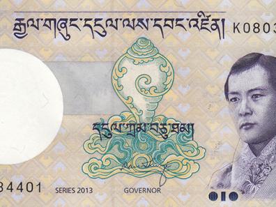
Tibetan script and numbers are also used in Bhutan.
There is traditionally no equivalent of bold, roman or italic in Tibetan typography, but since the mid-20th century the use of bold has been attested in some Tibetan books published in China, to signal emphasis.
Evolution of Tibetan typefaces in Western countries
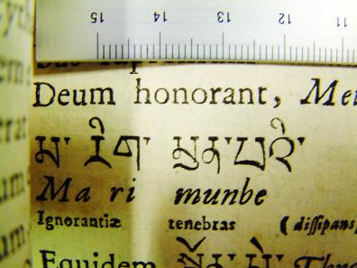
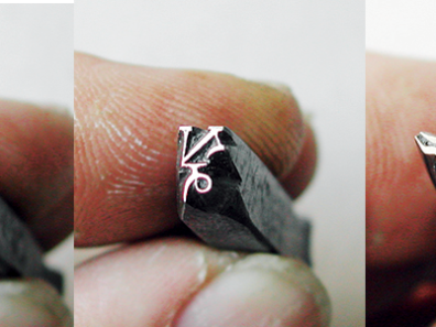
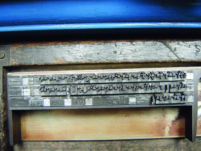
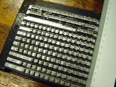
The typefaces mentioned in the following paragraphs were engraved and cast in Western countries, with some exceptions. Although movable-type printing existed in China, and a type of movable wooden type had already been used in early Tibetan xylographs, the technique of printing with cast metal was not used in Tibet or Bhutan. In the 18th and 19th centuries, Western missionaries exported their knowledge of the Tibetan language and script to their homelands. There, Tibetan typefaces were engraved, mainly to print dictionaries, grammar manuals or religious works, all of which were useful to the missionary enterprise. Their publications were also used by Western orientalists. From the 20th century onwards, textbooks and other publications were printed for Tibetans themselves.
The earliest Tibetan printing dates back to 1738. Antonio Fantautius (dates unknown) had engraved his punches for the printing works of the Sacra Congregatio de Propaganda Fide[2] in Rome. These typefaces were first used in the Alphabetum Tibetanum (1762).
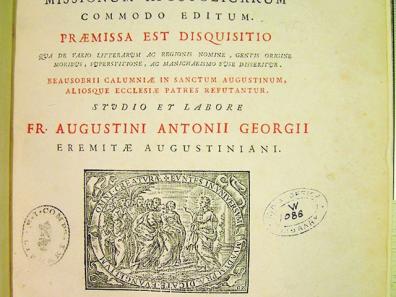
Fantautius's interpretation of Tibetan characters can be described as naïve, simplified and disrespectful of proportions. Some characters are very large and massive. In a group of consonants, the lower character is much smaller than it should be when combined with a vowel sign, which is itself oversized.
These typefaces were used for the next seventy-five years in other publications of the Sacra Congregatio de Propaganda Fide, for example as the Alphabetum Tangutanum sive Tibetanum (1773), but also by other printers.
Some of the original punches for the Fantautius typeface have been preserved and are now in the Cabinet des Poinçons at the Imprimerie Nationale in France. Daniel Berkeley Updike (1860-1941) reported in his Printing Types (1962, p. 183) how these punches had ended up there:
"Towards the end of the eighteenth century, the Propaganda printing house was ruthlessly stripped. Under the Directoire in France, "the government commissioners in charge in Italy of selecting 'the artistic pieces through which it is important to enrich France' took the necessary steps to procure, for the printing works of the Republic, a set of matrices of all the foreign printing typefaces that were in the Propaganda offices in Rome". This was in 1798. The following year, the 'necessary measures' were taken, and the French commissioners confiscated much of the material - not just punches and typefaces, but almost everything they could get their hands on - the Imprimerie being filled with typefaces which, although stamped typis imperialibus, had been stolen from the Propaganda printing house (!)(sic)."
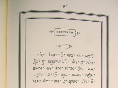
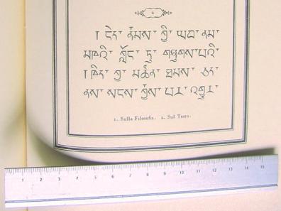
Giambattista Bodoni of Parma (1740-1813) was the first person to engrave Tibetan characters in two different sizes. The second volume of his Manuale Tipografico (1818) refers to these two body sizes as Filosofia (body 10) and Sul Testo (body 14). Their shapes were heavily influenced by Fantautius's Tibetan. Not only had Bodoni's grandfather worked at the Propaganda Fide printing house, but Bodoni had begun his career there as a typographer. He used his Tibetan typefaces to compose the Tibetan translation of the "Our Father" in his Oratio Dominica of 1806.
A new type style was developed around the same time by a Hungarian, Sándor Kőrösi Csoma (Alexander Csoma de Kőrös) (1784-1842). Three different type sizes were engraved for the printing of his dictionary and grammar in 1834. The Csoma typeface was used until the 1950s for publications by the Calcutta Baptist Mission Press.
Isaak Jacob Schmidt (1779-1847), born in Amsterdam, translated Csoma's grammar and dictionary into German and Russian for the St. Petersburg Academy of Sciences. In 1836, the Academy's publishing house produced a typeface in two sizes: one in size 20 for the composition of the grammar book, and a smaller one in size 14 for the appendices and the dictionary.
.

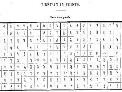
France has followed Russia's lead by engraving new Tibetan typefaces. In this country, already marked by a century of interest in oriental studies, the Imprimerie Nationale turned to Marcellin Legrand, a renowned and skilful punch engraver, to engrave a Tibetan typeface in two sizes. In addition to these Tibetan typefaces, Legrand also engraved twenty other typefaces for different writing systems around the world, during the twenty-seven years he spent working for the foundry. The first Tibetan typeface he engraved was "tibétain corps 18" in 1839, as presented in the Spécimen des types divers de l'Imprimerie nationale (1878). This work also includes the "tibétain corps 15", again by Legrand, which was created a little later, in 1841.
The Kaiserlich und Königlichen Hof- und Staatsdruckerei in Vienna was a serious competitor to the British and French royal printers. Three different sizes of Tibetan type were produced, all in 1850, in 12, 16 and 24 point sizes. Unfortunately, K. K. Hof- und Staatsdruckerei was bombed during the Second World War, and the vast majority of its printing equipment, machinery and archives were destroyed.
The K. K. Hof- und Staatsdruckerei was a major competitor to the British and French royal printers.
Around the 1880s, a typeface with a similar design, influenced by Vienna typefaces, was produced in Britain by Stephen Austin & Sons, in Hertford. Although it wasn't fully used by composers until 1918, this Tibetan typeface appeared in their first collection of type specimens, published around 1880. In particular, it was used to compose the Tibetan passages of articles published in volumes of the Journal of the Royal Asiatic Society. The Stephen Austin & Sons collection of type specimens published in 1953 shows that the foundry created a second type size, in size 17. The British Library in London currently holds a large number of Stephen Austin & Sons typefaces from writing systems all over the world, including both sizes of their Tibetan type.
The British Library in London currently holds a large number of Stephen Austin & Sons typefaces from writing systems all over the world, including both sizes of their Tibetan typefaces.

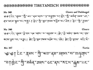
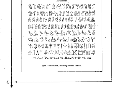
Another important figure in the development of Tibetan typefaces was Berlin-born Ferdinand Theinhardt (1820-1909). In 1881, the Secretary of State for India in Council commissioned a reprint of the Tibetan dictionary compiled for the Berlin Academy of Sciences by missionary Heinrich August Jäschke (1817-1883), written during the latter's twenty years in the Himalayas. Although this edition was published in London, it was entirely manufactured and printed by the prestigious Gebrüder Unger publishing house in Berlin. Jäschke himself drew the preliminary sketches of the new typeface, and Ferdinand Theinhardt, who had already engraved a hieroglyphic typeface, was commissioned to engrave and cast it.
Theinhardt's Tibetan and hieroglyphic typefaces are shown one after the other in his Musterbuch of 1895. In 1884, Horace Hart (1840-1916) purchased Theinhardt's Tibetan typefaces to add to the Oxford University Press's collection of "Oriental" typefaces.
But Theinhardt's printing type, measuring just 0.918 inches[3], was too small (or short?) to be used by OUP's presses, so it was melted down again to conform to OUP's type height of 0.938 inches[4]. The purpose of this was to make the Tibetan characters compatible with the rest of this printing house's equipment. The book The List of Ancient and Modern Greek and Oriental Founts, printed by Vivan Ridler at OUP in 1959, confirms that the "double pica font was melted down"[5].
OUP's Tibetan typefaces are now in London's St Bride Library. This typeface was transferred there between 1983 and 1989, after the closure of the OUP typography workshop. It contained 170 cassettes and 950 packets of typefaces, dating from the 17th to the 20th century, most of them cast in Oxford to print Western and "Eastern" languages, including what are known as "Fell typefaces".
Theinhardt's Tibetan is generally considered to possess an ideal form for Tibetan metal typefaces. From the moment it was created, around 1880, it appeared in numerous publications around the world. From a typographic point of view, Ferdinand Theinhardt succeeded in translating the characteristics of Tibetan handwriting into an elegant, well-proportioned metal typeface. On the contrary, his Tibetan typefaces faithfully reflect Tibetan script, and have directly or indirectly influenced foundries and printers for other typefaces.
Historical models in the serviceof contemporary solutions
The ongoing project, "Tibetan Typerform" ["Tibetan Typefaces"], which the author started in October 2004 at the Department of Typography and Graphic Communication at the University of Reading, studies the development and typographic use of the main Tibetan typefaces, from their inception in 1738 to the present day[6].
A comparative survey devoted to Tibetan typeface casting and typesetting practices has been undertaken in order to identify the different methods employed to solve the typographic challenges inherent in Tibetan script, such as the wide range of typefaces required, the vertical composition of consonantal groups, the positioning of diacritical marks, etc. Particular attention is paid to the historical period of manual typesetting, which laid the foundations for later typographic developments. Thanks to good relations between the British Library, the St Bride Library and the Typography Department at Reading, Stephen Austin's typefaces from the British Library were transferred to the St Bride Library on May 3, 2006, enabling a detailed study of these typefaces to be undertaken and compared with those used by Oxford University Press.
.
The aim of this research project is to study the functionality of contemporary Tibetan typefaces and to propose a clean methodology for the use of OpenType font features, in order to overcome the challenges posed by Tibetan typesetting, and thus enrich Tibetan typography. It has resulted in a book, Tibetan Typeforms, the final part of which contains proposals for the development of a digital typeface based on in-depth research, covering the history of Tibetan typography and backed by consultation with Tibetan language experts. Sound design decisions will be made that take into account the latest technological developments.
Jo De Baerdemaeker
This text is an updated version of the article "An introduction to the Tibetan script and typography", TYPO 26, April 2007: 2-9.
Translated from English by Françoise Robin, with assistance from Xénia de Heering and Emilie Rigaud.
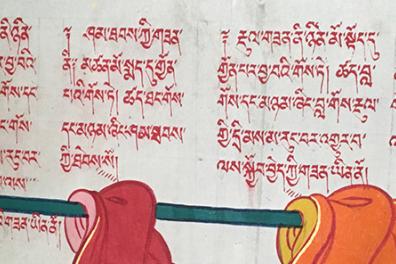
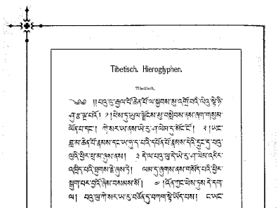
Image at head of article
Extract from the code of monastic discipline (vinaya) concerning monastic vestments, illustrated on the wall of a Ngaba monastery (Photo: Françoise Robin)
Bibliography
De Baerdemaeker, Jo. 2020. Tibetan typeforms. Amsterdam: Uitgeverij De Buitenkant
Noordzij, Gerrit. 1986. Zetten bij Thieme. Nijmegen: Thieme
Schubert, Johannes. 1950. 'Typographia Tibetana', Gutenberg-Jahrbuch Vol.25. Mainz, pp. 280-298.
Tracy, Walter. 1986. Letters of credit: a view of type design. London: Gordon Fraser
Updike, Daniel Berkeley. 1962. Printing Types: their history, forms and use. Third edition, volume 1. Cambridge, Massachusetts: The Belknap Press of Harvard University Press
Notes
[1] The earliest religious texts produced by woodblock or xylogravure printing date back at least to the 13th century.
[2] Called in French "Sacred Congregation for the Propagation of the Faith".
[3] Or 23.3 millimeters.
[4] Or 23.8 millimeters.
[5] Before the harmonization of type sizes, the Anglo-Saxon world used the typographic point known as "pica" (NDT).
[6] It is not intended to review all existing fonts and typefaces, but to investigate those that were, or still are, most widely used by renowned printers and/or found in technological applications throughout the history of Tibetan printing, right up to the most recent digital developments. The period of study therefore starts in 1738, when the first Tibetan printing typeface was engraved, and runs right up to the present day.
Some links to visit for the illustrations used in this article and taken from wikimedia.org
Tibetan alphabet.
https://upload.wikimedia.org/wikipedia/commons/thumb/c/c6/The_Tibetan_a…
The four vowel diacritics, their placement in relation to the root letter and their names in Tibetan.
https://upload.wikimedia.org/wikipedia/commons/thumb/a/aa/Tibetan-U+0F7…
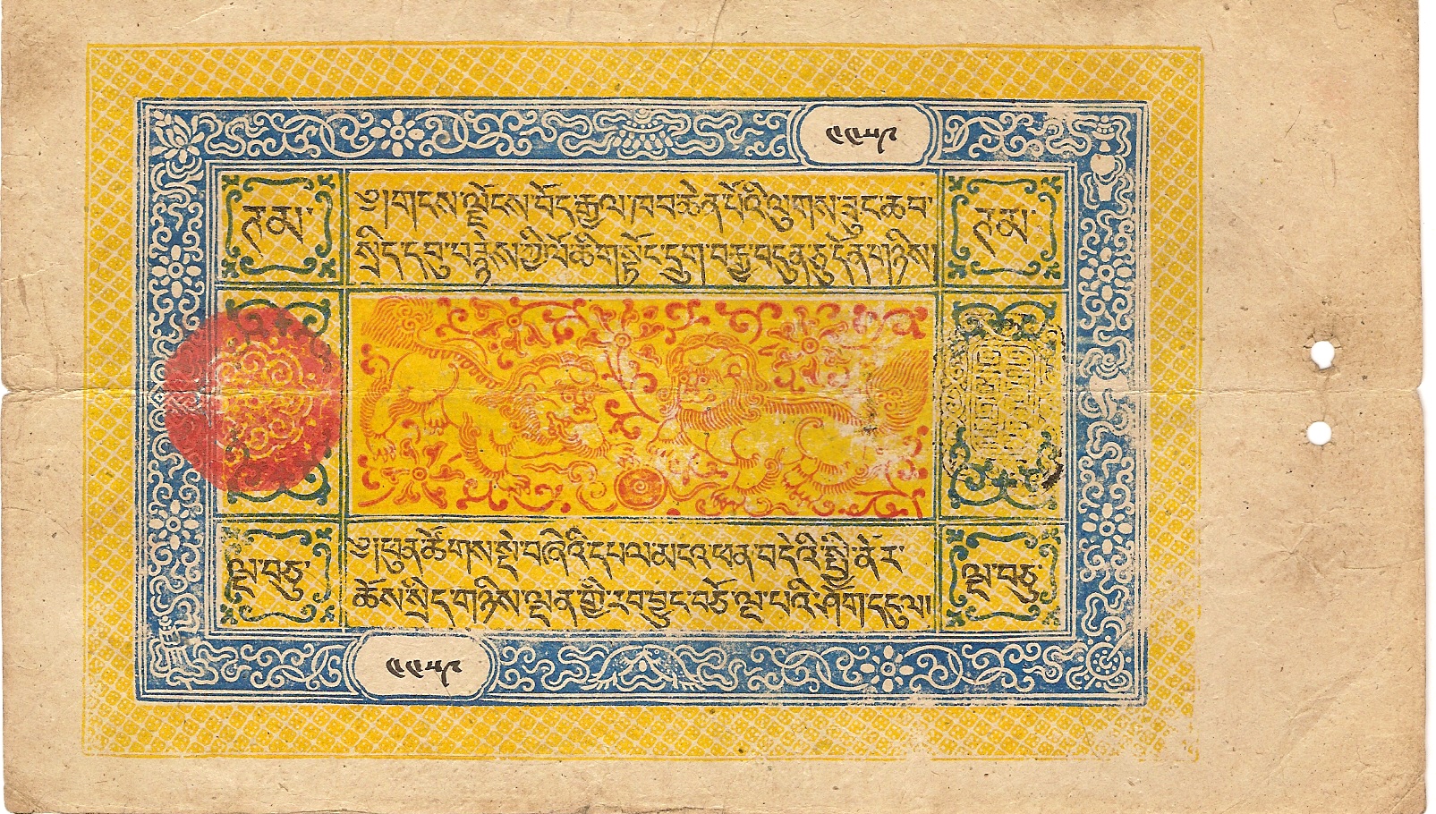
Tibetan bill.
https://upload.wikimedia.org/wikipedia/commons/f/f5/Tibet_50_tam_1672.j…
Bhutanese bill.
https://upload.wikimedia.org/wikipedia/commons/e/ea/Bhutan_10_Ngultrum_…